

Responsive Web Design Benefits: Boost SEO & Conversions
Introduction
In today’s digital-first world, responsive web design benefits for businesses are more crucial than ever. A responsive website adapts seamlessly across all devices, providing an optimal user experience whether viewed on a smartphone, tablet, or desktop. For businesses, this means increased engagement, higher conversions, and a competitive edge.
Responsive design ensures your website provides a consistent experience for all visitors, regardless of the device they’re using. Whether you’re focusing on improving your customer journey or expanding your reach, responsive web design is essential in 2025.
What is Responsive Web Design?
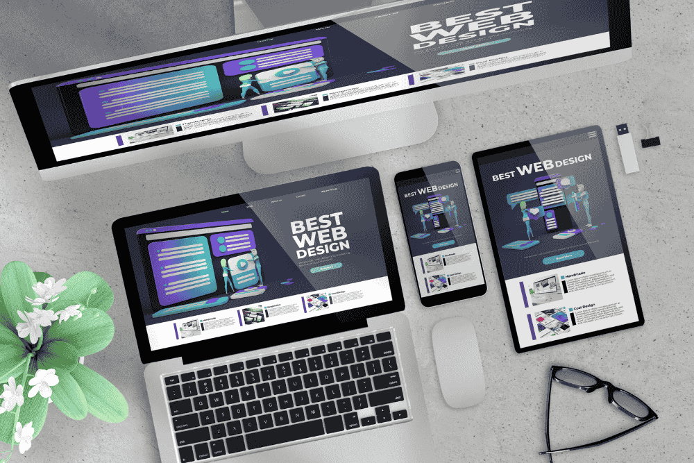
Responsive web design is an approach to web development where websites automatically adapt their layout and content to fit the screen size and orientation of the device being used. This ensures a consistent and user-friendly experience for all visitors.
Key Characteristics of Responsive Web Design:
- Fluid grids and flexible images that adjust to different screen sizes.
- Media queries for device adaptability, allowing the layout to change based on the screen’s width, height, or orientation.
- Seamless UX across all screen sizes, from smartphones to desktop monitors.
Why Responsive Design Matters in 2025
With mobile traffic now accounting for over 60% of global web usage, having a mobile-optimized site isn’t just a recommendation—it’s a necessity. Google also prioritizes mobile-friendly websites in its ranking algorithm, making responsive design a key factor in SEO performance.
In addition, users now expect websites to load quickly and look great on any device. If your site isn’t responsive, you risk losing potential customers to competitors who have invested in modern, adaptable web design.
Top Responsive Web Design Benefits
1. Improved User Experience
User experience (UX) is a key element of a successful website. A responsive layout ensures that visitors can easily navigate your site, no matter the device they use. With an optimized design, your business provides a seamless experience, encouraging users to stay longer and interact more.
2. Higher Mobile Traffic
Businesses can tap into the massive mobile audience by ensuring their website is responsive. Mobile visitors will have the same great experience as desktop users, leading to more traffic and higher conversion opportunities. This is especially important as mobile shopping continues to grow.
3. Faster Page Loading
Responsive websites tend to be more lightweight and faster compared to non-responsive counterparts. This boosts SEO performance and improves overall user satisfaction. Page speed is a critical factor for both rankings and conversions—users won’t wait for a slow-loading page.
4. Better SEO Rankings
Google loves responsive websites. With a single URL for all devices, you avoid duplicate content issues, making it easier for search engines to index your site. This streamlined structure improves your site’s crawlability and helps improve your SEO ranking.
5. Lower Bounce Rates
When your site looks good and functions well on all devices, visitors are more likely to stay. A lower bounce rate is a positive signal to search engines and can result in better rankings. Moreover, users are more likely to return to your site if it offers a good mobile experience.
6. Easier Maintenance
Managing multiple versions of your website can be time-consuming and costly. A responsive design reduces the need for separate mobile, tablet, and desktop versions, which simplifies updates and reduces maintenance costs. All content is managed in one place, streamlining your workflow.
7. Increased Conversion Rates
Consistency across devices fosters trust with your audience. A smooth user experience enhances the likelihood of visitors converting—whether that’s making a purchase, filling out a contact form, or signing up for a newsletter. Responsive design can increase lead generation and drive conversions for service-based businesses.
8. Stronger Brand Image
A modern, responsive site builds trust and positions your business as professional and up-to-date. First impressions count, especially online. A responsive website shows your audience that your business cares about its digital presence and user experience.
How to Implement Responsive Web Design
Implementing responsive design involves:
- Using CSS media queries to define how your site should adjust to different screen sizes.
- Designing mobile-first, ensuring your website works well on mobile before scaling up for larger screens.
- Testing on multiple devices to ensure seamless UX on smartphones, tablets, and desktops.
- Leveraging responsive frameworks like Bootstrap or Tailwind CSS to speed up development.
- Optimizing images and text blocks for flexible layouts that adapt to different screen sizes.
Pro Tip: Partner with a web design consultant to ensure your site is built right from the start. If you’re unsure, check out Choosing a Web Design Consultant for Small Brands: What to Know for more guidance.
Real-World Examples
Example 1: Local Bakery Website
A local bakery optimized its website with a responsive layout, leading to a 35% increase in mobile orders within three months. Customers could easily view the menu and place orders on any device, leading to higher conversion rates.
Example 2: Home Services Business
A plumbing company revamped their outdated website with a fully responsive design. As a result, they saw a 25% boost in online quote requests. The clean layout and intuitive mobile navigation were key factors in the improvement.
Conclusion
In summary, the responsive web design benefits for businesses extend far beyond aesthetics. From improved SEO to better customer engagement and higher conversions, responsive design is a foundational element of a successful online presence. It simplifies maintenance, saves time, and ensures your brand is represented well on any screen.
FAQs about Responsive Web Design Benefits
1. What are the primary benefits of responsive web design?
Responsive web design improves user experience, boosts mobile traffic, enhances SEO rankings, reduces bounce rates, and increases conversion rates by ensuring a consistent and seamless experience across devices.
2. How does responsive web design affect SEO?
Responsive design helps improve SEO by ensuring that your site is mobile-friendly, avoiding duplicate content, and providing a single URL for all devices, which makes it easier for search engines to crawl and index your content.
3. Why is mobile responsiveness important for my business?
With over 60% of web traffic coming from mobile devices, a mobile-friendly website is essential for capturing that audience. Responsive design ensures that users have a smooth experience, which can lead to higher engagement and more conversions.
4. How do I implement responsive web design on my website?
You can implement responsive design by using CSS media queries, designing mobile-first, and leveraging frameworks like Bootstrap or Tailwind CSS. It’s also essential to test your site on multiple devices to ensure proper functionality.
5. Can a responsive website increase my conversion rates?
Yes, a responsive website can increase conversions by providing a seamless, user-friendly experience across all devices. This improves customer trust and makes it easier for users to take action, such as filling out forms, making purchases, or contacting your business.
We Build Websites That Work While You Sleep — Let’s Launch Yours!
👉 Ready to Scale Your Business? Book Your FREE Consultation and Discover How to Attract More Clients with a High-Converting Website Built to Engage and Convert Your Ideal Customers.