loader image

Responsive Design

Perfect Experience on Any Device

Maximize Engagement with a Seamless Responsive Design

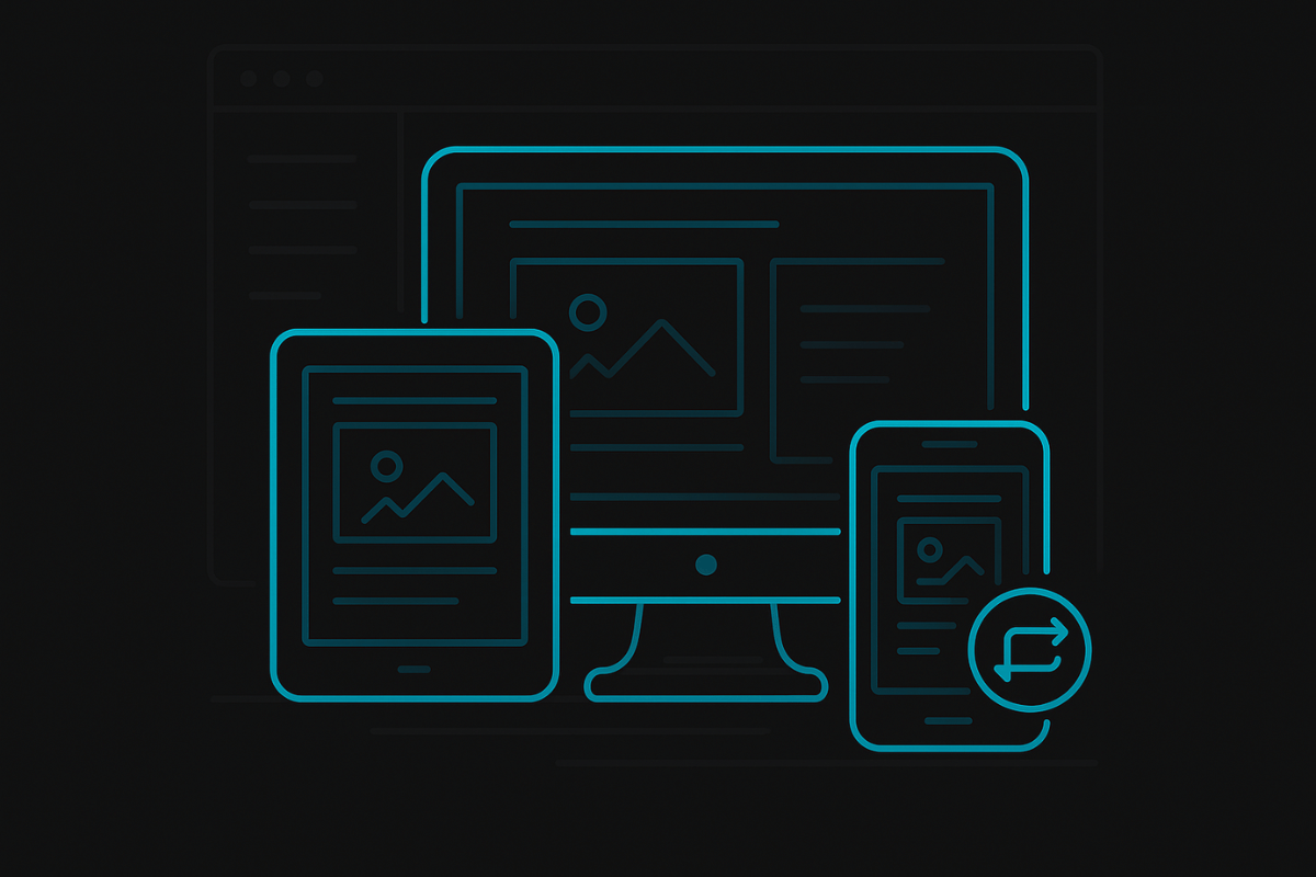
A responsive design ensures that your website looks and functions beautifully on any device, from desktops to tablets to smartphones. With more users browsing the web on mobile, having a website that automatically adapts to different screen sizes is crucial for keeping visitors engaged and preventing bounce rates. A responsive site creates a smooth, consistent user experience, no matter how or where it’s accessed.

By implementing a fully responsive design, we ensure that your site delivers an optimal experience across all platforms. Whether users are viewing your site on a small phone screen or a large desktop monitor, every element is perfectly adjusted to look great and function flawlessly. This flexibility boosts user satisfaction, increases time spent on your site, and significantly improves conversion rates by providing an accessible and enjoyable browsing experience.

Responsive Design
Why It Matters

Responsive Design That Adapts Seamlessly

Mobile Optimization

Responsive design ensures a seamless browsing experience on mobile devices, improving accessibility and engagement.

Desktop Compatibility

Your website adjusts perfectly to larger screens, offering smooth navigation and an optimal experience for desktop users.

Flexible Layouts

The design adapts fluidly to various screen sizes, ensuring content is properly displayed, no matter the device.

Enhanced User Experience

A responsive site enhances navigation and usability, increasing time spent on site and encouraging interaction.

How It Works

Our Responsive Design Execution Process

01

Mobile-Friendly Layout

We design your website to adapt perfectly to any device, from desktops to smartphones.

02

User Experience Optimization

We ensure easy navigation and fast loading times across all screen sizes.

03

Cross-Browser Compatibility

We test your website to ensure it performs consistently across all major browsers.

04

Continuous Testing

We test and update your design to ensure it stays responsive as devices and browsers evolve.

Ready To Scale?

Ensure Easy Navigation Across All Devices

We’ll create a responsive website that adapts across all devices, providing users with a seamless experience and improving engagement and conversions.

Hey there! Ask me anything!